
This was a passion project I took on to test my skills and put to use what I have learnt.
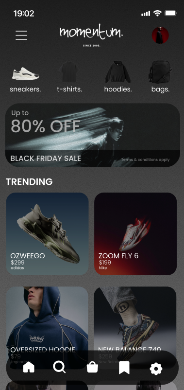
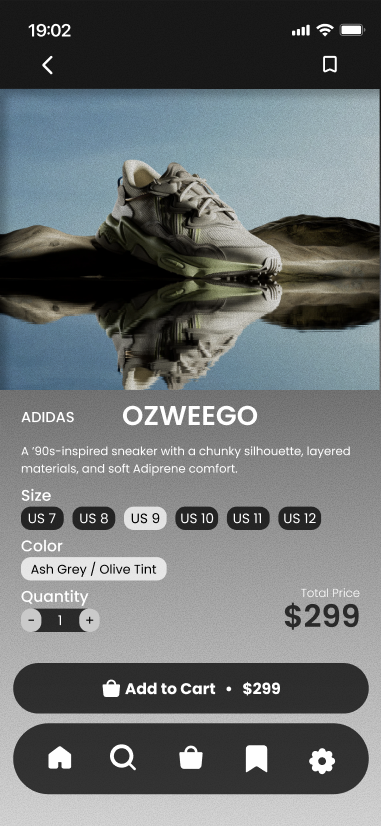
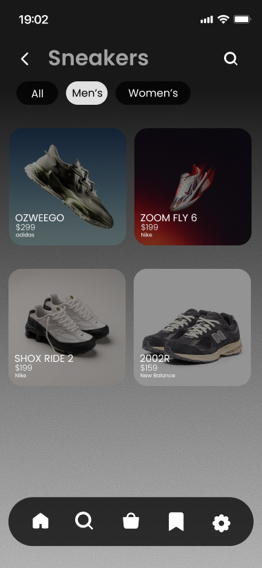
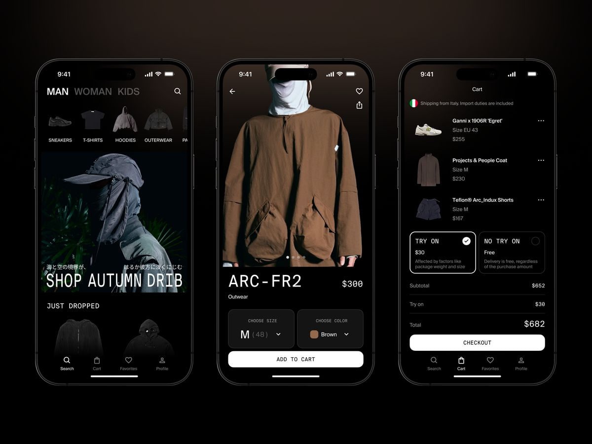
This time, I wanted to create a mobile app that allows users to purchase streetwear with convenience at its core of the design.
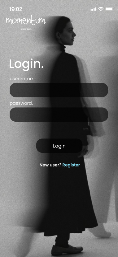
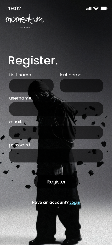
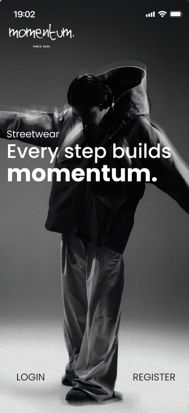
The app features a grainy black-white-grey color palette to create a minimalistic and neutral design that caters to most users. I also felt that this colorway matches the target audience that would use this app.
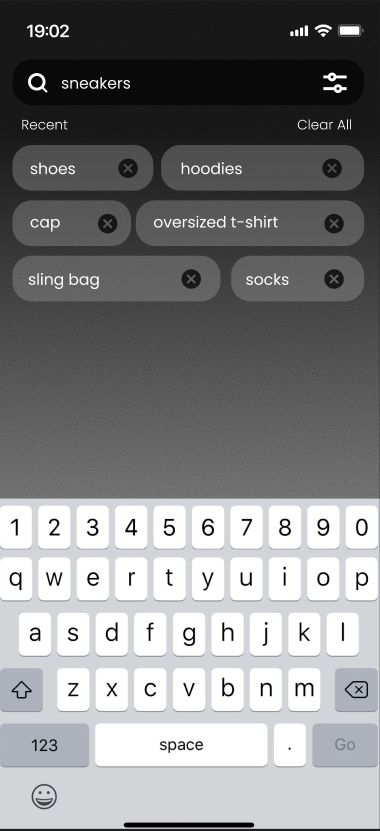
User Flow: Start from the landing page and tapping on either Login or Register, fill in the required text fields and tap the responding buttons. The app will then bring the user to the homepage where they can browse and search for products they want. Once user finds a product they want, they simply tap on add to cart and proceed with checkout on the cart page.
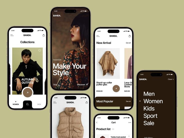
Firstly, I went to Pinterest to look for mobile app designs for inspiration and picked out the few that caught my eye. From these, I learnt and implemented the elements that I wanted from these designs into my own.

Secondly, I went to Adobe Express to start experimenting with logos as I have already decided on a brand name called 'Momentum'. It is a streetwear distributor brand focusing more on footwear and I wanted to create a mobile app for users to view and purchase products from their mobile phones
Background image on Login/Signup screen: https://pin.it/X4nv0Oh29
Background image on Homepage screen: https://pin.it/3YIf9QAAT
Assets:
https://www.shein.co.uk/Men-s-...
https://editorialist.com/p/off...
https://www.amazon.com/FAIABLE...
https://www.homewode.com/produ...
https://www.ardene.com/ca/fr/s...
http://about.nike.com/en/newsr...
https://hypebeast.cn/2021/5/fu...
ADIDAS OZWEEGO RENDER :: Behance
https://www.instagram.com/p/DE...
https://sabasnet.com/collectio...
https://www.bershka.com/gb/men...
https://www.opumo.com/magazine...
https://pin.it/3Yz5OPGi3
https://www.katinusa.com/colle...
https://pin.it/2MnqrNYsP
https://pin.it/DYNBo0skC
https://pin.it/33KOdtF3I
https://www.instagram.com/p/C4...
https://pin.it/L9IEBouQg
https://pin.it/54b2mhWCh
https://pin.it/3QeW1tLxW